


For a lot of my life, I believed color theory didn’t really matter all that much. Just the phrase by itself sounds so academic, like a class you’d take in college. In reality, understanding even the basics of color theory can make choosing colors for weaving much easier and can help you avoid the common pitfall of choosing yarns in colors that you think are contrasting that don’t really contrast.
Say you want to weave a beautiful log-cabin style color-and-weave shawl, something where the shifting of the contrasting-colored stripes creates a fabulous optical illusion. While it’s almost always a safe bet to go with white as one color and dark something as the other, what if you want to be more adventurous with your color choices?
Enter value. In the world of color theory, value relates to the weight of a given color and how dark it is when it’s in grayscale. If you want two colors to contrast with one another in a color-and-weave pattern, their values need to contrast, something that might not be obvious when you’re simply putting two skeins of yarn next to one another.
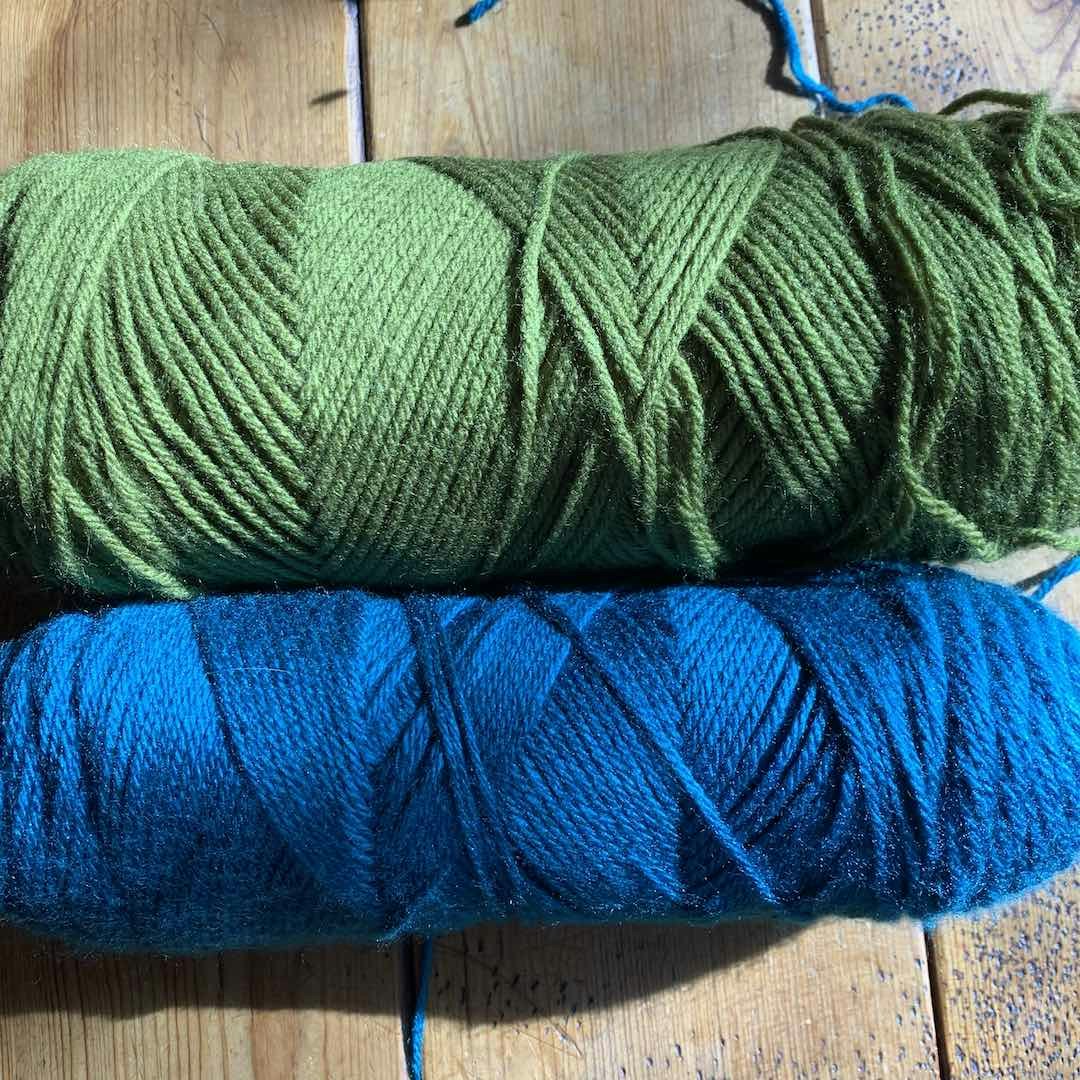 The green and blue yarns shown here appear to pair beautifully, but do they contrast? Photos by Christina Garton unless otherwise noted
So how do you figure out whether or not two colors have different enough values? You use your smartphone! In the example below, I’ve put two put-ups of yarn next to one another. In color, they look great together and if I didn’t know better, I wouldn’t think twice about pairing them in a color-and-weave pattern. However, after snapping the original photo, I went into edit mode and turned it to gray scale, which you can see in the photo below. In that photo, the skeins are very similar shades of gray. This tells me that if I were to use these two yarns together in color-and-weave they’d blend a bit too well and the patterns wouldn't pop in the way that I want.
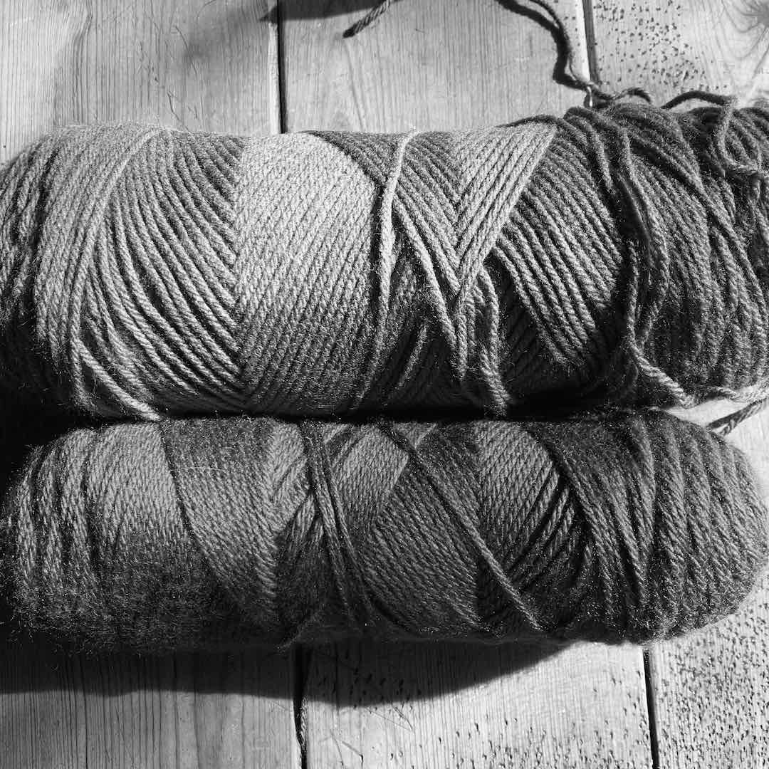 When viewed in gray scale the blue and green yarns are suddenly all but indistinguishable.
Now let’s swap out the green yarn for a pink yarn. At first glance the colors look great together and, lucky me, when I turn the photo to gray scale the shades of gray are very different. For a project where I need contrast, these two yarns will play nicely together.
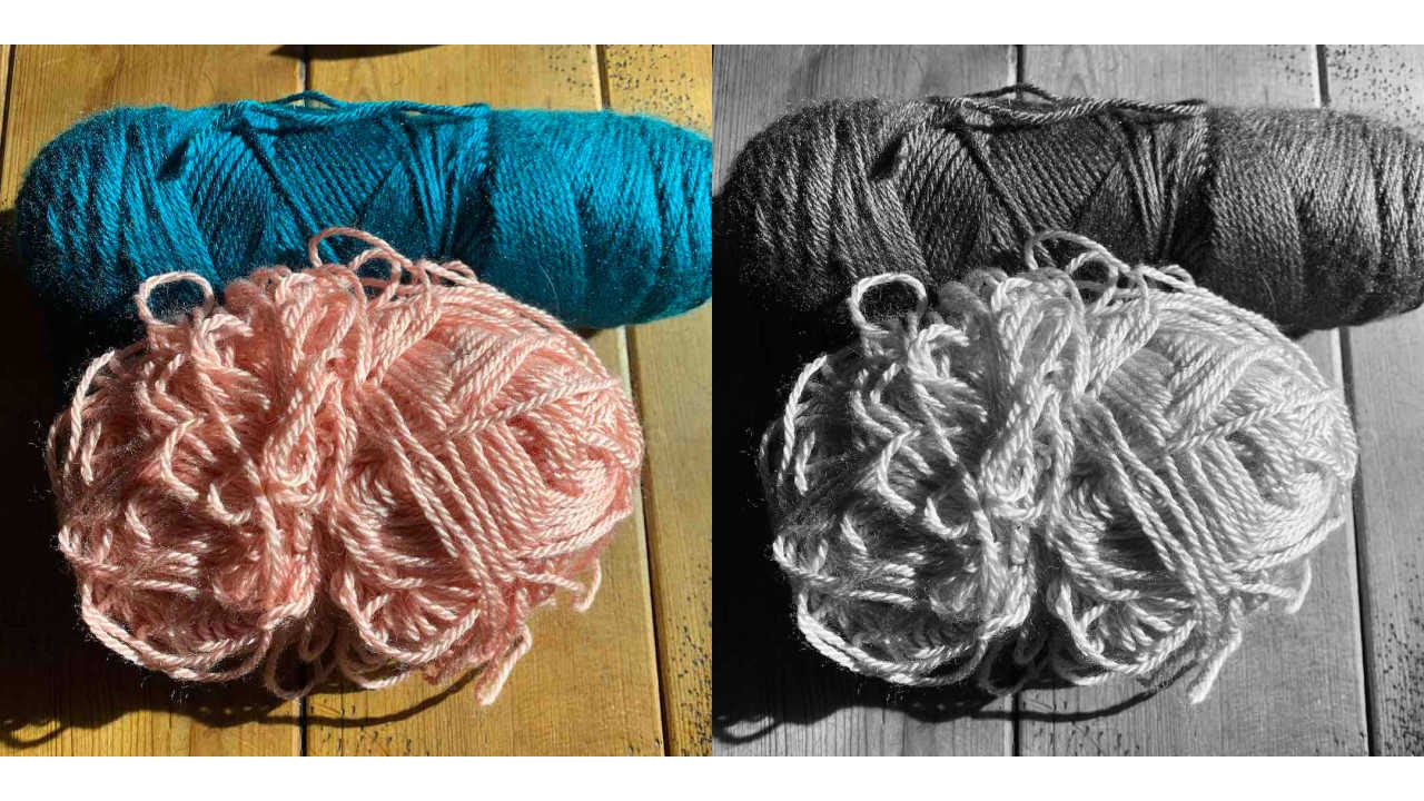 The pink and blue yarns contrast in color and in black-and-white meaning they have different values.
Knowing about value and contrast is important when choosing colors for a log-cabin shawl but understanding them has other uses too. For example, if you’re creating something visual for a person who is color blind, having different values can make it more readable and appealing. While it might be difficult for that person to distinguish green and red (the most common type of color blindness) they will be able to discern the difference in color values easily.
Happy Weaving! Christina
PS: Want to learn more about color theory in weaving? Deb Essen is teaching her Color in Weaving Workshop at the upcoming Weave Together with Handwoven Retreat. Learn more about the retreat and how you can attend here.