


Since I started weaving, plain weave has been my “comfort food.” When life speeds up, plain weave’s steady rhythm does the opposite—it slows everything down, giving me space to breathe and sort through my thoughts.
But reaching that peaceful place isn’t always easy. More than once, I’ve been desperate to sit and weave, only to find the loom empty and a wall of decisions blocking the way. Choosing colors, committing to a warp design, convincing myself I needed to buy one more color to “complete” my yarn stash . . . my process would stall before it even began. I’m sure I’m not the only weaver who’s been there. Eventually, I found a shortcut through the decision-making barrier that makes getting to weaving a lot easier.
The next time you’re craving a quick, colorful project, try this design approach. It’s perfect for plain weave, works with both stripes and plaids, and (assuming you have a healthy stash) lets you get weaving right away!
The Formula: LMD123
LMD123 stands for Light, Medium, Dark in proportions of 1 part light, 2 parts medium, 3 parts dark. I try to think of it less as a rule and more as a guideline. To use a cooking analogy, light colors are like salt or seasoning, while the medium and dark colors are the main ingredients—you want your seasoning to enhance your dish without overwhelming it.
Choosing Your Colors
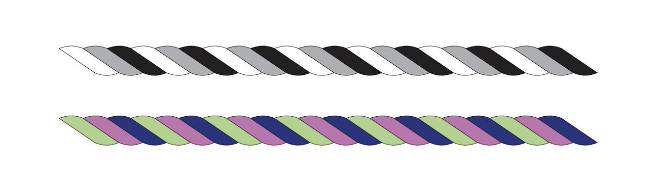
For her LMD123 method, Jennifer begins by choosing three colors with a clear step between values and twisting them together. Whether you’re using a neutral palette, like the twist at the top of the image, or a more colorful one, like the one at the bottom, the contrast in value should be obvious.
Pick three yarns—one light, one medium, one dark—and twist them together. Look for a clear step between the values. The most extreme examples of light, medium, and dark would be white, medium gray, and black. The contrast in your colors won’t be that extreme, but they should still be easily distinguishable, as in the image above.
As you choose your colors, be aware that some can be misleading. Lavender is a common example: It often feels “light,” but depending on the amount of gray in it, it can land in the medium range.
To make sure your eyes aren’t being fooled, here are two ways to objectively determine a color’s value (lightness or darkness):
- Take a black-and-white photo of the yarns together. Their differences in value will become much more apparent.
- Use an artist’s gray scale. A gray scale (sometimes referred to as a value finder) is a simple tool artists use to compare values. It’s a printed card showing a range of graduated grays from white to black. You can buy one at most art supply stores, or make your own using a dark pencil on paper. Stretch the yarn across the gray scale. The point where the yarn shows the least contrast indicates its true value, as you can see in the image below.
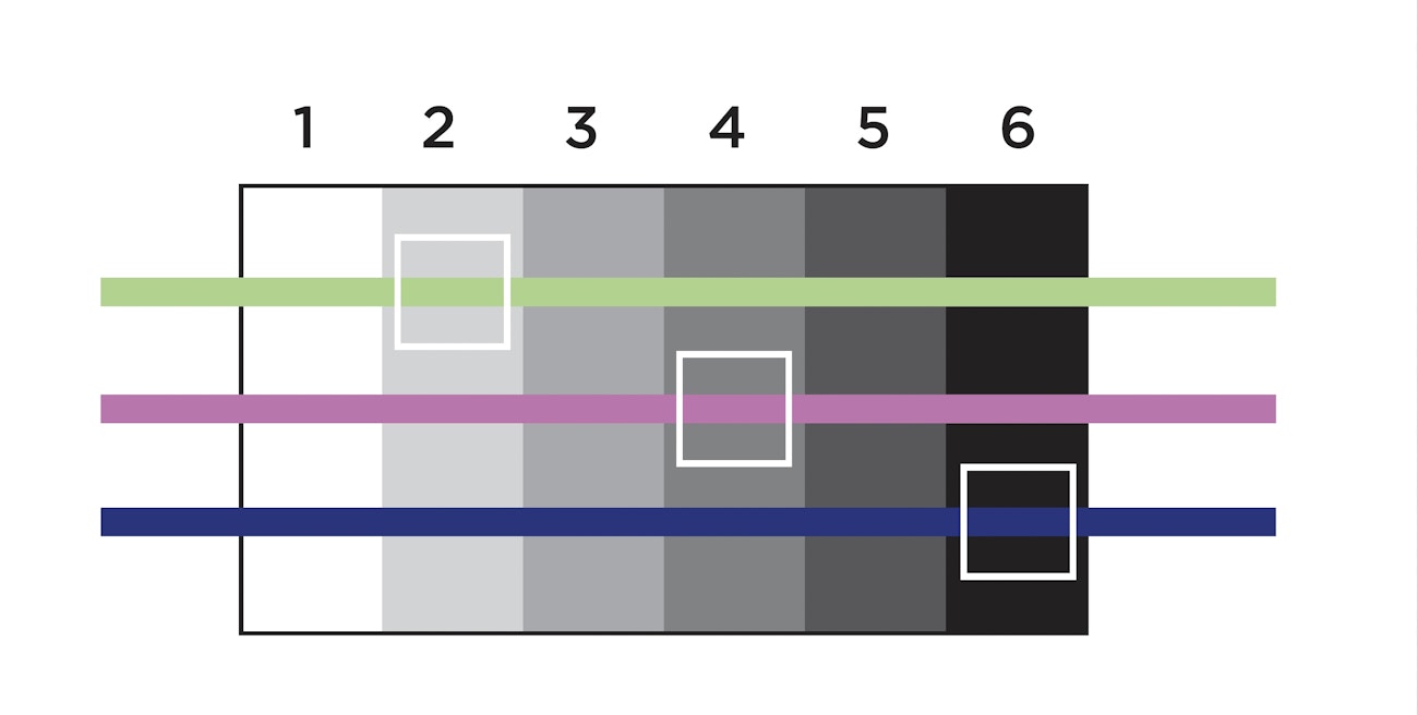
To find a color’s true value, you can compare it to a grayscale.
Designing the Warp
Once you’ve chosen your light, medium, and dark colors, how you lay them out is up to you.
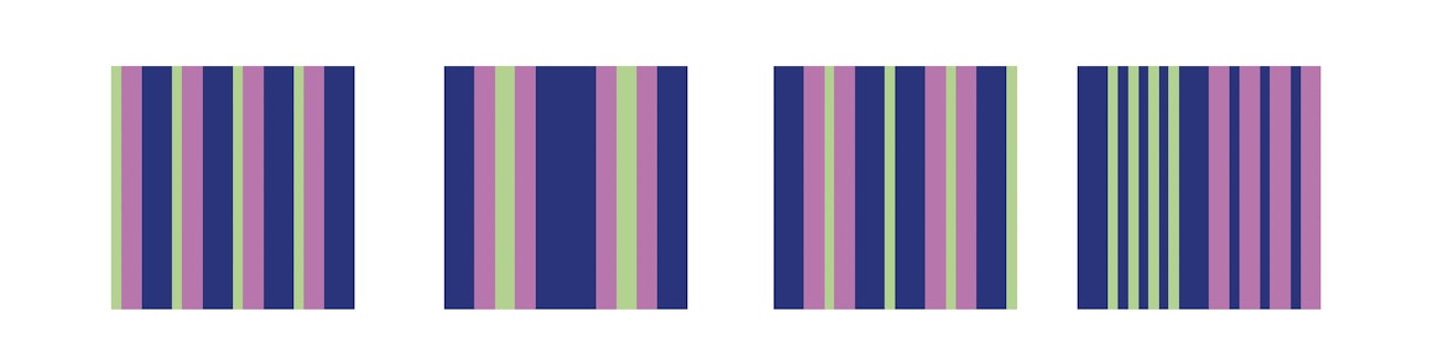
Once you’ve chosen your trio of colors, build your warp stripes using the 1:2:3 proportions as a guide. Above are just a few examples—you can make the stripes regular or random. If you run out of a color, simply swap in any other color of the same value. In other words, if you run out of Light, use another Light color with the same true value as the original.
Choosing the weft
For weft, you have many options:
- Use a single color (a dark weft will enhance the warp color while a light weft will mute it).
- Repeat the warp sequence to create a plaid.
- Create a second LMD123 palette and weave it as stripes in the weft (if you’re worried about the cloth turning muddy, try my method for making a weave-less gamp to see how the colors will interact.)
Proof of Concept
The examples illustrated here were created using the LMD123 approach. The colors were chosen only for their values and used in 1:2:3 proportions. None of the combinations are palettes that I would have instinctively chosen, but once woven, they all “work!”
Happy weaving!
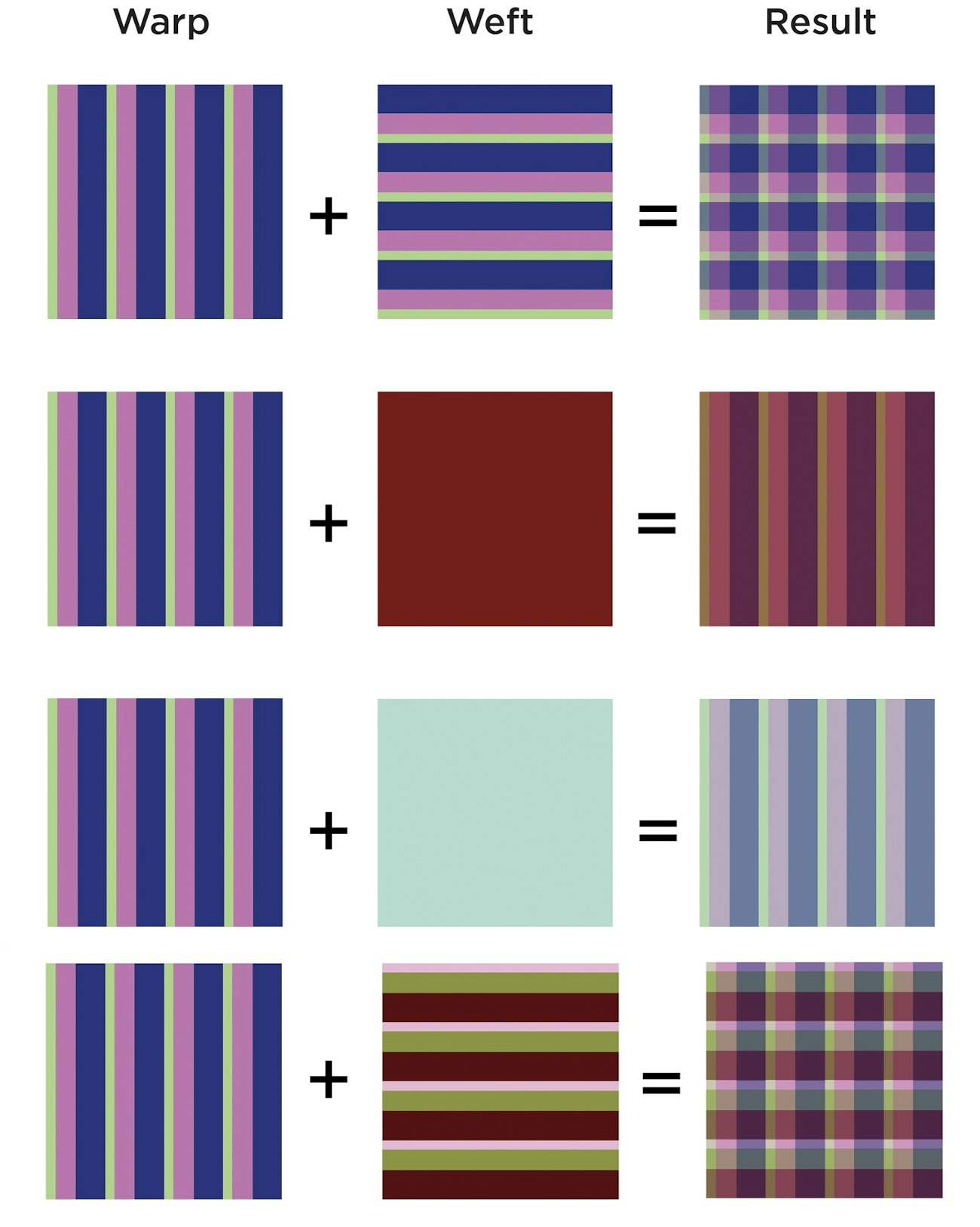
From left to right: warp stripes, weft color or colors, and final result.