Subscriber Exclusive
Make it Your Own: Intersecting-Light Placemats
Learn 3 fun ways to modify this project by Jodi Ybarra from the Winter 2024 issue, including a subscriber exclusive color variation.
Learn 3 fun ways to modify this project by Jodi Ybarra from the Winter 2024 issue, including a subscriber exclusive color variation. <a href="https://littlelooms.com/make-it-your-own-intersecting-light-placemats/">Continue reading.</a>
https://littlelooms.com/cdn-cgi/image/format=auto/https://www.datocms-assets.com/70931/1726673538-llwn24_ptrn_intersectinglightplacemats_jybarra.jpg?auto=format&w=900
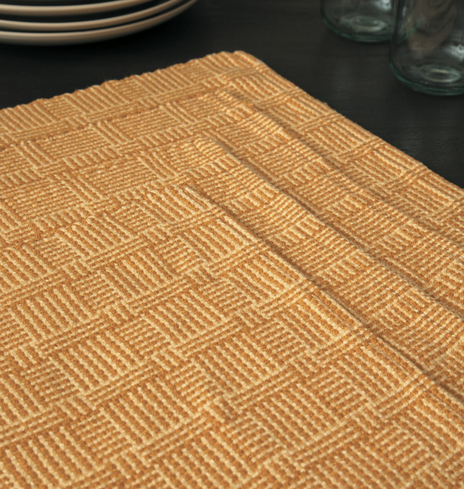
Intersecting Light Placemats by Jodi Ybarra. Photos by Matt Graves
I’ve said it before, but I love log cabin. This simple color-and-weave pattern has countless variations, and it’s a great way to create cloth that looks complex with simple plain weave. It is log cabin’s simplicity that also makes it a great vehicle for experimentation. Take the Intersecting Light Placemats by Jodi Ybarra from the Winter 2024 issue. You can weave it as written or have a bit of fun playing with the pattern and palette. In this subscriber bonus article, we’ve got some ideas and even a bonus color palette for making this project your own. (Not a subscriber? Learn more about subscriptions and what they have to offer here.)
First, consider playing with the block sizes by weaving different variations of the patterning by making blocks smaller or larger. To do so, increase or decrease the repeats in the weft color order. See what happens when all the blocks are the same size or try playing with asymmetry.
SUBSCRIBER EXCLUSIVE
Unlock the Full Article with a Little Looms Subscription
Get instant access to this article and the entire Little Looms library of weaving projects, techniques, and expert instruction. With your subscription, you'll receive:
Step-by-step project guides
Skill-building tutorials and design inspiration
Access to premium weaving content, updated regularly
Little Looms Magazine
Easy Weaving with Little Looms offers education and inspiration for weavers on rigid-heddle, inkle, tapestry, pin looms and more.
Plans start at just $4.99/month. Cancel anytime.
I’ve said it before, but I love log cabin. This simple color-and-weave pattern has countless variations, and it’s a great way to create cloth that looks complex with simple plain weave. It is log cabin’s simplicity that also makes it a great vehicle for experimentation. Take the Intersecting Light Placemats by Jodi Ybarra from the Winter 2024 issue. You can weave it as written or have a bit of fun playing with the pattern and palette. In this subscriber bonus article, we’ve got some ideas and even a bonus color palette for making this project your own. (Not a subscriber? Learn more about subscriptions and what they have to offer here.)
First, consider playing with the block sizes by weaving different variations of the patterning by making blocks smaller or larger. To do so, increase or decrease the repeats in the weft color order. See what happens when all the blocks are the same size or try playing with asymmetry. [PAYWALL] You can even add a statement pick here and there of a contrasting color and see what happens. And that brings me to another way you can change up this project: color.
 Jodi also wove the project in a purple palette, this time with two placemats and a runner instead of four placemats.
The first and most obvious way to play with this project is to weave a runner in addition to, or instead of, the placemats. As the project note suggests, you can add 36” extra warp for a runner, but you have other options as well. You can put on a 60” warp instead and weave just a runner. Or, you can use the warp amount suggested and weave a runner and two placemats with a little bit left over for sampling—perfect for playing with the aforementioned block sizes.
One of the many reasons I love these placemats is the monochromatic palette. Instead of choosing two wildly contrasting colors, such as black and white, Jodi chose two yellows: A bold gold and a subdued pastel. The result is absolutely elegant and easy to emulate with other colors. In fact, Jodi even wove an extra set in purple, which you can see above. For these, Jodi used the same Pearly Pearl 6/2 cotton, but this time in Blue Violet and Lavender. It’s the same project, but as you can see, just changing the color makes it feel completely different.
Ready to get weaving? Check out the Fall 2024 issue in the library, free for subscribers! Whether you weave this project as written, or give it a little tweak to make it work better for you and your home, I hope you have fun!
Happy Weaving,
Christina


 Jodi also wove the project in a purple palette, this time with two placemats and a runner instead of four placemats.