
I love to play with color. If a knitting pattern or weaving draft calls for one or two colors, my impulse is to use at least three. After all, as Kaffe Fassett once said, why use just one color when 20 are available? Gradients are at the top of my list of favorite techniques when it comes to working with fiber. The word itself evokes visions of colors that play—colors that shift and change even as I create the fabric.
I began weaving inkle bands with crochet cotton, which is easily available but lacks the range of colors that I needed to achieve satisfying gradients. As I wove, I honed my inkle-weaving skills but yearned for yarns with more color choices.
When I bought my first Lunatic Fringe 10-color Petite Gamp Kit 10 years later, I fell head over heels in love. The company’s Tubular Spectrum line of mercerized cotton includes 45 hues, tints, and tones around the color wheel, along with grays, black, and white. Here were enough beautiful colors to create gorgeous inkle bands! Finally, I had everything I needed to create the wonderful glowing gradient bands that had filled my dreams.
Designing a Single-Gradient Band
When we talk about gradients, we’re referring to the way two or more adjacent colors appear to blend to form more colors. The ombré effect is an example of a gradient. For this effect to work, the colors you’re blending need to have only slight differences in either hue or value, something that can be difficult to source with traditional bandweaving yarns.
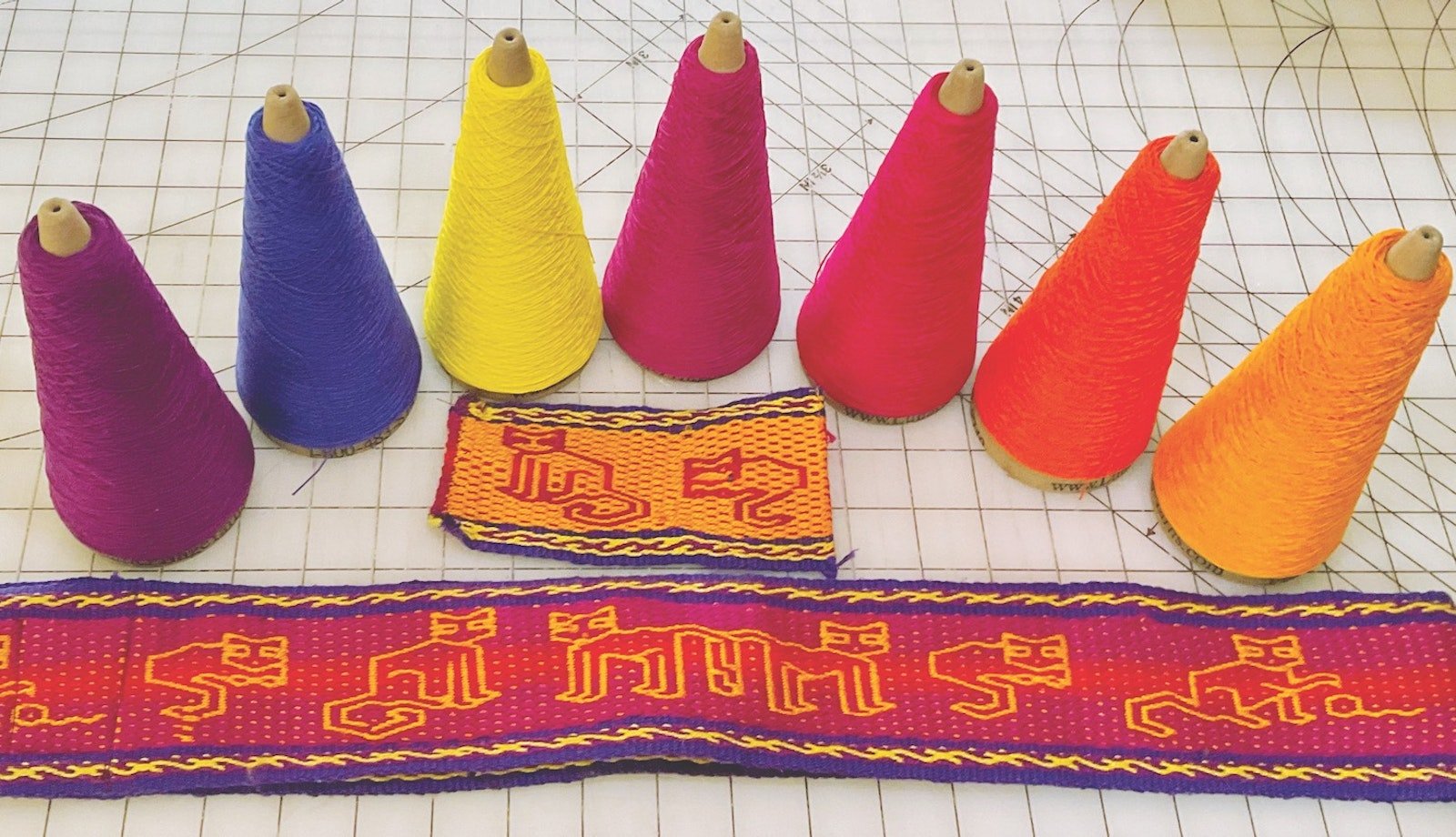
For my Cats at Play guitar strap, which you can see in the header above, I chose to work with some pebble-weave patterns designed by Laverne Waddington. Pebble weave is a warp-faced, two-sided fabric. Because of the way it’s woven, the threads for Sides A and B are warped together. To make the patterns on both sides stand out, I knew I needed very high contrast between the sides. I decided on a gradient of red and its analogous colors for Side A and a solid gold for Side B.
 This Cats at Play guitar strap was Julie's first foray into weaving gradients.
My favorite gradients are those with darker shades at the edges and a lighter shade down the center. I began with considering my favorite Red-Purple #10 and #5 for the edges and then pondered the center color, which needed to be quite a bit lighter. My husband, who is an artist, suggested Yellow-Red #5. I’d already selected Yellow-Red #10 for the center of the gold side, and I admit I was concerned that it would be too close. But I decided to move ahead anyway.
For the warp, I used #5 Purple-Blue, #10 Purple, and #10 Yellow for the borders. Side A’s center gradient had wide stripes of Red-Purple #5 next to the borders, followed by narrower stripes of the brighter Red-Purple #10, and a very narrow stripe of the lighter Yellow-Red #5 in the center. Side B’s center was the darker #10 Yellow-Red. The weft was #5 Purple-Blue.
Once I started weaving this band, I was mesmerized by the colorplay that emerged. The brilliant red side glows as if lit from within, and the bright Yellow-Red #10 cat outlines pop out from the background. The reverse side has red gradient cats frolicking on a golden background. I’d achieved my beautiful gradient!
Combining Multiple Gradients
I wove my Rolling River band after making many other gradient bands. For this one, I wanted to play with two gradients in another pebble-weave pattern by Laverne Waddington. I used two colorways that were very similar in color value and relatively low in contrast. One side would graduate from dark to light to dark again, and the other side would be the opposite, light to dark to light.
 For her Rolling River band, Julie wanted not only a gradient effect, but also a high-contrast border to better set off the gradient in the middle.
This time the borders were high-contrast, with areas of #5 Yellow-Red surrounding #10 Yellow. Side A had the darker #10 Purple next to the borders, followed by stripes of #5 Red-Purple and a center stripe of #10 Red-Purple. Side B had the lightest #5 Green next to the borders, followed by #10 Green and a center stripe of #5 Blue.
As I wound the warp, I wondered whether there was enough contrast in the center pattern—but I started weaving anyway. To my delight, the pattern that emerged was truly beautiful. The Red-Purple center glows with an inner light. Blues, greens, reds, and purples wash over each other, always drawing the eye upward along the rolling pattern.
The biggest surprise was that while this band is also two-sided, the sides look the same! There is an equal amount of each gradient on each side, and both colorways share their space beautifully. I used this band to make project bags and an eyeglasses cases.
Final Thoughts
Gradient effects are the result of a subtle blending of multiple colors. As I work with them, I’ve learned that adding a color that is a few shades darker or lighter than I might expect (or even from a slightly different part of the color wheel) makes for a stunning result.
I also take special care when I include more than one gradient on two-sided weavings. If they’re too similar, the gradients get lost. On the other hand, too much contrast between two gradients can look messy. Taking the time to carefully consider groups of colors before committing to an approach really does pay off.
Looking at grayscale pictures of the yarns is a great way to learn whether they have enough (but not too much) contrast. And there’s nothing better for learning how gradients work than weaving lots of bands, so I encourage you to get out there and do some weaving!
PS from the editor: If you enjoyed Julie's article and would like to have more information on color and value in weaving, check out The Value of Color Theory for a simple primer. —Christina